Trend Analysis of Supreme T-Shirt Sales on StockX
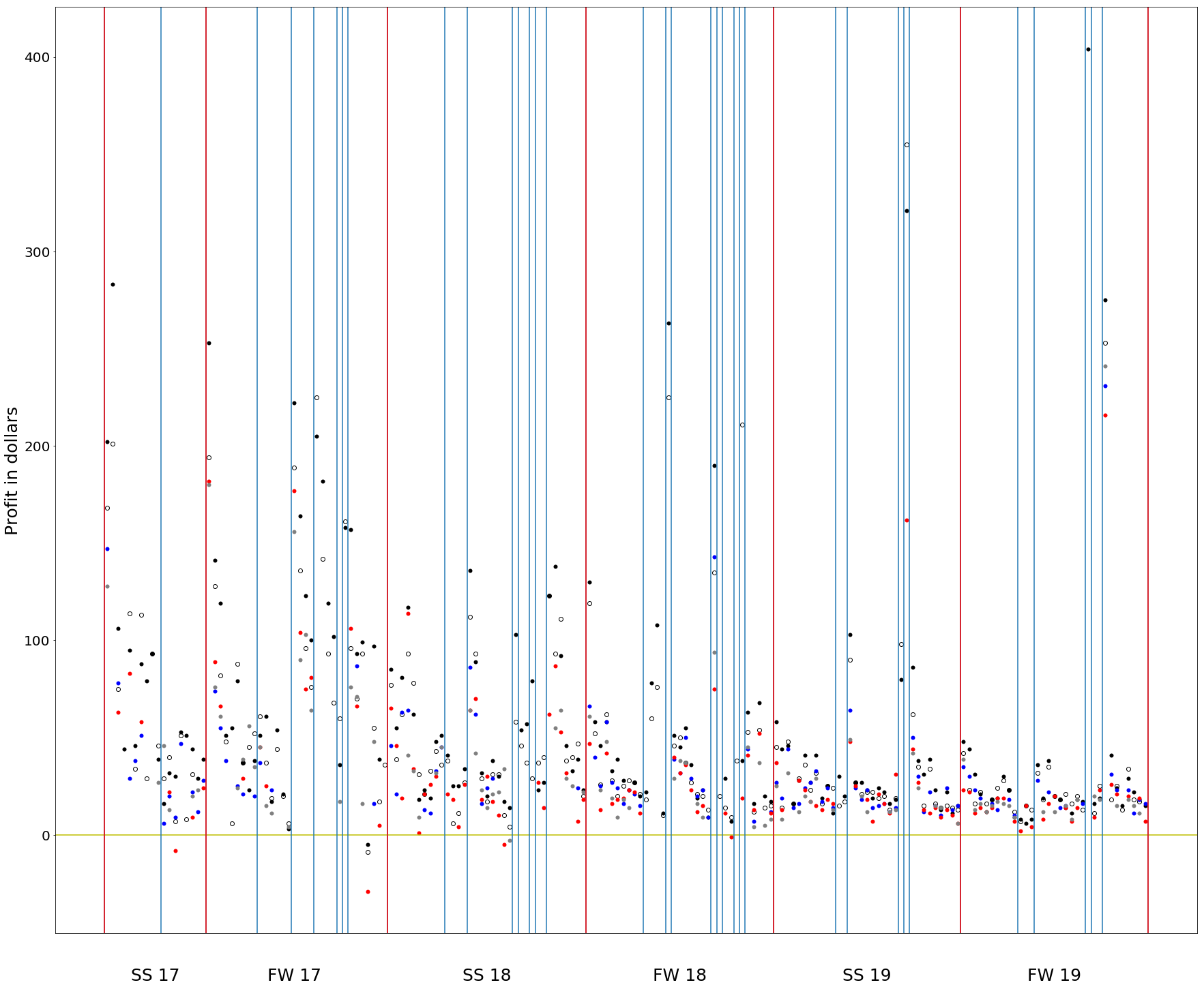
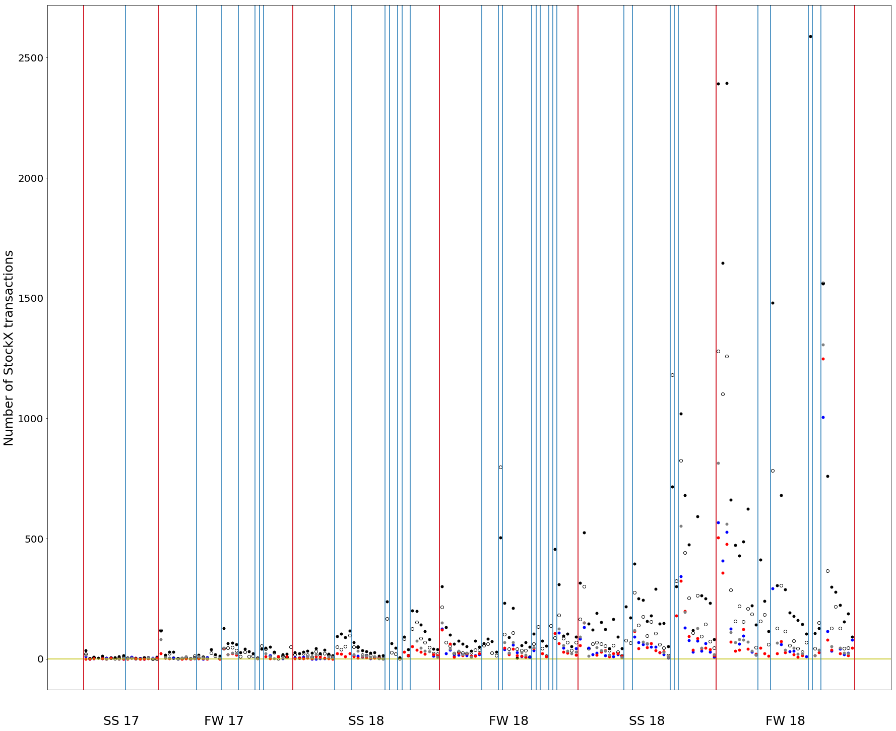
Using StockX's data, I was able to gather information on Supreme tee sales from drop seasons Spring/Summer 2017 to Fall/Winter 2019. The red lines in both graphs represent season intervals, and the blue lines represent the weeks that Supreme released tees (most times they don't).
Columns of data inside the same blue interval represent t-shirts released on the same week. Each column represents a single t-shirt design. For example, the first column of points represents the SS 2017 Sade Tee. The color (among white, black, grey, navy, and red) of each data point in a column represents the t-shirt colorway. To simplify, I chose the above colors since they were the most frequently released and averaged over all the sizes.
The first graph charts the profit (StockX sale price minus retail, not including shipping and StockX fees). The second graph charts the number of transactions on StockX.
Observations: Black tees tend to outperform both on price and number of sales. It is clear that the resell profit of Supreme tees on StockX has decreased over the years, while the number of sales is increasing. For a while, although StockX makes resale transactions more secure, I've observed that resale prices have been significantly lowered. This data seems to provide concrete proof. While StockX has made Supreme easier to buy, it has also made Supreme less exclusive, therefore decreasing the hype and profit in reslling.
Profit of Supreme Tees Sold on StockX

Amount of Supreme Tees Sold on StockX
